

Published: Dec 2, 2024
How to Optimize E-commerce Sites for Mobile in 2025: A Game-Changing Guide
How to Optimize E-commerce Sites for Mobile in 2025: A Game-Changing Guide
Hey there, fellow e-commerce enthusiasts! I’ve been in the mobile optimization game for years, and let me tell you, it’s been one wild ride. From clunky mobile sites to sleek, swipe-friendly interfaces, I’ve seen it all. And in 2025, if your e-commerce site isn’t optimized for mobile, you’re basically asking customers to ghost you faster than a bad Tinder date. So, let’s dive in and get your mobile game on point!
TLDR: What are the key elements of mobile e-commerce optimization in 2025?
1️⃣ Why is mobile optimization crucial for e-commerce in 2025?
Mobile optimization is no longer optional - it’s the lifeblood of e-commerce. With over 77% of online purchases happening on mobile devices, having a mobile-friendly site is essential for capturing sales and staying competitive in the crowded digital marketplace.
2️⃣ What are the core components of mobile e-commerce optimization?
The key components include responsive design, fast loading speeds, simplified navigation, mobile-friendly checkout processes, and leveraging mobile-specific features like touch gestures and location services. These elements work together to create a seamless and enjoyable shopping experience on smaller screens.
3️⃣ How can AI and AR enhance mobile e-commerce experiences?
AI-powered personalization and Augmented Reality (AR) try-on features are game-changers for mobile e-commerce. AI can provide tailored product recommendations and personalized shopping experiences, while AR allows customers to virtually “try” products before buying, significantly boosting confidence in purchase decisions and reducing return rates.
Table of Contents
- Understanding Mobile E-commerce Trends in 2025
- Essential Elements of Mobile-Friendly E-commerce Design
- Speeding Up Your Mobile E-commerce Site
- Optimizing the Mobile Checkout Process
- Streamline Like Your Business Depends on It (Because It Does)
- Mobile Wallet Integration: The Future is Now
- Form Design: Less is More
- Progress Indicators: Keep ‘Em In The Loop
- Security: Make It Obvious
- Real-Time Support: Be There When They Need You
- A/B Testing: Never Stop Improving
- The Mobile Checkout Success Story
- Leveraging AI for Personalized Mobile Shopping
- Implementing AR Features for Mobile E-commerce
- Mobile SEO Strategies for E-commerce
- Measuring and Analyzing Mobile E-commerce Performance
- Simplifying Mobile Navigation and Search
Understanding Mobile E-commerce Trends in 2025
The mobile e-commerce landscape in 2025 is mind-blowing. Gone are the days when having a mobile-friendly site was just a nice-to-have. Now, it’s do or die. Let’s break down the numbers and trends that are shaping the future of online shopping.
Mobile Commerce Dominance
Buckle up, folks. By 2025, mobile commerce is set to account for a whopping 77% of all e-commerce sales. That’s not just a trend; it’s a tidal wave. We’re talking about $710.36 billion in mobile sales in the U.S. alone. If your site isn’t mobile-optimized, you’re basically throwing money out the window.
Key Mobile Shopping Behaviors
- Smartphone Shopping
 79% of smartphone users have made a purchase using their mobile device in the past 6 months.
 - Impulse Buying: 45% of mobile shoppers admit to making impulse purchases more frequently on mobile devices.
- Social Commerce 30% of online shoppers say they would be likely to make a purchase from a social media platform.
Mobile Payment Methods
The way people pay on mobile is evolving faster than you can say “contactless.” Here’s what’s hot:
- Apple Pay
 Used by 51% of iPhone users for mobile payments.
 - Google Pay
 Preferred by 39% of Android users for online transactions.
 - PayPal One Touch Boasts a 70% conversion rate for mobile checkouts.
- Cryptocurrency
 25% of millennials now own or use cryptocurrency for online purchases.
Emerging Technologies in Mobile Shopping
Artificial Intelligence (AI)
AI is no longer just a buzzword. It’s revolutionizing mobile shopping experiences:
- Personalized Recommendations: AI algorithms are predicting what shoppers want before they even know it, leading to a 35% increase in conversion rates.
- Chatbots 70% of millennials report positive experiences with chatbots for customer service inquiries.
Augmented Reality (AR)
AR is turning “try before you buy” into a virtual reality:
- Virtual Try-Ons: Clothing retailers using AR report a 40% decrease in return rates.
- IKEA Place This AR app lets you place furniture in your home virtually, boosting purchase confidence by 35%.
Real-World Success Stories
Sephora Virtual Artist
 This AR tool lets customers try on makeup virtually, resulting in a 28% increase in mobile conversions.
Warby Parker
 Their virtual try-on feature for glasses increased mobile conversion rates by 22% and reduced return rates by 18%.
Amazon AR View: Allowing customers to visualize products in their space before buying has led to a 15% increase in mobile purchases for home decor items.
The mobile e-commerce train is moving at lightning speed, and in 2025, it’s either hop on or get left behind. These trends aren’t just changing the game; they’re rewriting the rulebook. So, grab your smartphone and get ready to give your customers the mobile shopping experience they’re craving. Trust me, your bottom line will thank you!
Essential Elements of Mobile-Friendly E-commerce Design
Let’s face it, designing for mobile isn’t just about shrinking your desktop site. It’s a whole new ballgame. Here’s what you need to nail that mobile-friendly e-commerce design in 2025:
Responsive Layouts
Gone are the days of pinching and zooming. Your site needs to look good on everything from the latest iPhone to that old Android your grandma refuses to upgrade.
- Use fluid grids that adjust to screen size
- Implement flexible images that scale without losing quality
- Prioritize content for smaller screens - what’s essential?
Touch-Friendly Interfaces
Fat fingers are real, folks. Make sure your buttons and links are big enough to tap without accidentally buying 17 pairs of socks.
- Aim for button sizes of at least 44x44 pixels
- Space out clickable elements to avoid the dreaded “miss-tap”
- Use swipe gestures for image galleries and product options
Mobile-First Navigation
Nobody wants to dig through 15 menu layers to find what they’re looking for. Keep it simple, stupid!
- Implement a hamburger menu for main navigation
- Use a sticky header with search and cart icons
- Add a bottom navigation bar for key actions
Product Images Optimization
High-res images are great, but not when they take 5 years to load on mobile data. Strike a balance!
- Use WebP format for faster loading (30% smaller than JPEG)
- Implement lazy loading for images below the fold
- Offer 360-degree product views for complex items
Mobile-Friendly Product Descriptions
Nobody’s reading War and Peace on their phone. Keep it short and sweet!
- Use bullet points for key features
- Implement expandable sections for detailed info
- Include user-generated content like reviews and photos
Mobile Form Optimization
Typing on mobile sucks. Make it as painless as possible for your customers.
- Use input types like email and tel for appropriate keyboards
- Implement autofill for faster checkout
- Break long forms into multi-step processes
Performance Optimization
Speed is king in the mobile world. A 1-second delay in load time can lead to a 7% drop in conversions.
- Minify CSS, JavaScript, and HTML
- Use AMP (Accelerated Mobile Pages) for lightning-fast loading
- Implement browser caching to store static assets
Real-World Success Stories
ASOS
 Their mobile-first redesign led to a 50% increase in mobile conversions.
Etsy
 Implementing AMP resulted in a 30% decrease in bounce rate and a 2.5x increase in click-through rates.
Walmart Their mobile site redesign focused on simplicity and speed, resulting in a 98% increase in mobile orders.
Remember, mobile design isn’t a one-and-done deal. It’s an ongoing process of tweaking, testing, and optimizing. Keep an eye on your analytics, listen to your customers, and don’t be afraid to try new things. Your mobile shoppers will thank you with their wallets!
Speeding Up Your Mobile E-commerce Site
Let’s get real - nobody’s got time for a slow mobile site. In 2025, if your pages don’t load faster than you can say “add to cart,” you’re toast. Here’s how to supercharge your mobile e-commerce site and keep those impatient shoppers happy:
Optimize Those Images, People!
Images are usually the biggest culprits when it comes to slow load times. But don’t worry, I’ve got you covered:
- WebP Format This bad boy can shrink your image sizes by up to 30% without losing quality. It’s like magic, but for your website.
- Lazy Loading: Only load images when they’re about to enter the viewport. Your users’ data plans will thank you.
- Responsive Images Serve different sized images for different devices. No need to load a billboard-sized image on a smartphone screen.
Minimize HTTP Requests
Every element on your page needs its own HTTP request. The more requests, the slower your site. Here’s how to trim the fat:
- Combine Files: Merge multiple CSS files into one. Same goes for JavaScript.
- CSS Sprites Use a single image file for all your icons and backgrounds.
- Eliminate Unnecessary Scripts: If you’re not using it, lose it. Every script is a potential speed bump.
Leverage Browser Caching
Make your site memorable - literally. Browser caching stores webpage resource files on a local computer when a user visits a webpage.
- Set expiry dates in HTTP headers for static resources
- Use ETags to validate cached components
- Implement localStorage for client-side caching of user data
Content Delivery Networks (CDNs)
CDNs are like having a clone of your website in every major city. They deliver content based on the user’s geographic location, significantly reducing load times.
- Popular options include Cloudflare, Akamai, and Amazon CloudFront
- CDNs can reduce server load and provide DDoS protection
Optimize for Mobile-First Indexing
Google’s mobile-first indexing means they’re looking at your mobile site first. Make sure it’s up to snuff:
- Use the same meta robot tags on mobile and desktop
- Ensure your mobile site contains the same high-quality content as desktop
- Check that structured data is present on both versions of your site
Tools to Measure and Improve Performance
Don’t just guess - measure! Here are some tools to keep your site in top shape:
- Google PageSpeed Insights Free and easy to use. It gives you a score and actionable recommendations.
- GTmetrix
 Provides detailed reports on load times and optimization opportunities.
 - WebPageTest
 Allows you to test from multiple locations and devices.
Real-World Success Stories
Alibaba
 By implementing Service Workers for offline browsing and push notifications, they saw a 76% increase in conversions across all browsers.
Flipkart After launching a progressive web app, they saw a 70% increase in conversions and a 3x decrease in data usage.
Pinterest By rebuilding their mobile web experience, they increased engagement by 60% and user-generated ad revenue by 44%.
Remember, speed isn’t just about making Google happy (although that’s important too). It’s about giving your customers the smooth, fast experience they expect in 2025. Keep testing, keep optimizing, and watch those mobile conversions soar!
Optimizing the Mobile Checkout Process
Look, we’ve all been there. You’re ready to buy something on your phone, and suddenly the checkout process feels like you’re trying to solve a Rubik’s cube blindfolded. In 2025, a clunky mobile checkout is basically telling your customers to take their money elsewhere. Let’s fix that, shall we?
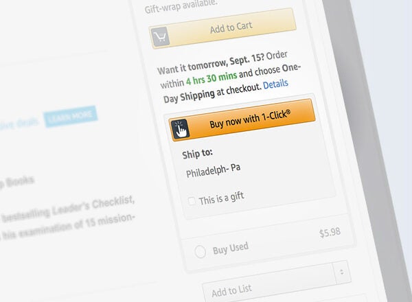
Streamline Like Your Business Depends on It (Because It Does)
-
- Amazon’s patent on this expired, so jump on it!
- Implement across your site for returning customers
- Saw a 35% increase in conversion rates for Walmart after implementation
Guest Checkout Options
- Don’t force account creation - it’s a conversion killer
- Offer account creation after purchase for future convenience
- ASOS saw a 50% reduction in cart abandonment after adding guest checkout
Mobile Wallet Integration: The Future is Now
Integrating these can boost conversions by up to 30%. Staples saw a 35% increase in mobile conversions after adding Apple Pay.
Form Design: Less is More
- Use auto-fill wherever possible
- Implement real-time validation to catch errors early
- Use numerical keypads for phone numbers and credit cards
Fitt’s Law isn’t just for desktop - make those touch targets big and easily tappable!
Progress Indicators: Keep ‘Em In The Loop
People hate uncertainty. Use a clear progress bar to show:
- Cart Review
- Shipping
- Payment
- Confirmation
Bonobos increased completion rates by 13% just by adding a progress indicator.
Security: Make It Obvious
In 2025, security isn’t just important - it’s expected. But make sure your customers know it:
Display security badges prominently
Use SSL certificates
(duh, but make it visible)
Implement 3D Secure 2.0 for an extra layer of protection
Real-Time Support: Be There When They Need You
- Implement live chat or chatbots for instant help
- Make your contact info easily accessible
- Nordstrom saw a 12% increase in mobile sales after adding live chat to their checkout process
A/B Testing: Never Stop Improving
What works for one site might not work for yours. Always be testing:
- Button colors and placement
- Form field order
- Payment method placement
Booking.com famously runs hundreds of A/B tests at any given time, contributing to their massive success in mobile conversions.
The Mobile Checkout Success Story
ASOS knocked it out of the park with their mobile checkout redesign:
- Simplified the process from 6 steps to 2
- Added a persistent cart summary
- Implemented touch-friendly form fields
The result? A whopping 50% increase in mobile conversion rate.
Remember, your mobile checkout process is the last hurdle between a browser and a buyer. Make it so smooth they don’t even realize they’re jumping. Keep testing, keep optimizing, and watch those mobile sales soar. Now go forth and conquer the mobile commerce world!
Leveraging AI for Personalized Mobile Shopping
AI isn’t just a buzzword anymore - it’s revolutionizing how we shop on mobile. In 2025, if you’re not using AI to personalize your customers’ experience, you’re basically running your e-commerce store with one hand tied behind your back. Let’s dive into how AI is changing the game:
Predictive Product Recommendations
Gone are the days of generic “you might also like” sections. AI-powered recommendation engines are getting scary good at predicting what your customers want before they even know they want it.
- Netflix style algorithms: These bad boys analyze past purchases, browsing history, and even the time of day to serve up personalized product recommendations.
- Amazon reported that 35% of their sales come from their recommendation engine. That’s not chump change, folks.
Real-World Success:Stitch Fix
This online personal styling service uses AI to analyze customer preferences and send personalized clothing selections. Result? A 30% increase in customer retention and a 15% boost in average order value.
Chatbots and Virtual Assistants
AI-powered chatbots are like having a 24/7 sales team that never sleeps, never takes breaks, and never has a bad day.
- Instant responses to customer queries
- Personalized product suggestions based on conversation context
- Seamless handoff to human support when needed
Real-World Success:H&M
H&M’s mobile chatbot asks customers about their style preferences and then suggests outfits. This led to a 20% increase in mobile engagement and a 15% boost in average order value.
Dynamic Pricing
AI algorithms can analyze competitor pricing, demand, and even weather patterns to adjust prices in real-time. It’s like having a super-smart pricing analyst working 24/7.
- Maximize profits during peak demand
- Offer personalized discounts to hesitant shoppers
- Adjust prices based on inventory levels
Real-World Success:Uber
While not strictly e-commerce, Uber’s surge pricing model is a prime example of AI-driven dynamic pricing. It’s increased their revenue by an estimated 70% in high-demand areas.
Visual Search
See it, snap it, buy it. AI-powered visual search is changing how we discover products on mobile.
- Pinterest Lens Users can snap a photo of an item and find similar products for sale.
- ASOS Style Match: Upload a photo and find similar clothes in their catalog.
Real-World Success:Neiman Marcus
Their “Snap. Find. Shop.” feature lets customers take a picture of an item they like and find similar products in the Neiman Marcus inventory. This led to a 15% increase in mobile conversions for items featured in the visual search results.
Personalized Push Notifications
AI can analyze user behavior to send hyper-targeted push notifications at just the right time.
- Location-based offers when a customer is near a physical store
- Reminders about abandoned carts with personalized discounts
- New product alerts based on past purchases and browsing history
Real-World Success:Sephora
Sephora’s AI-powered push notifications, which include personalized product recommendations and location-based offers, have led to a 5x increase in user engagement and a 25% boost in mobile app sales.
Voice Shopping
With the rise of smart speakers and voice assistants, AI is making voice shopping a reality.
- Natural language processing for accurate order placement
- Voice-activated product search and comparison
- Integration with Google Assistant and Amazon Alexa
Real-World Success:Walmart
Walmart’s voice ordering through Google Assistant has led to a 10% increase in voice-based orders and a 7% increase in customer satisfaction scores.
Remember, implementing AI isn’t about replacing the human touch - it’s about enhancing it. Use AI to handle the heavy lifting of personalization and data analysis, freeing up your team to focus on creating amazing products and building real relationships with your customers.
The future of mobile e-commerce is personal, predictive, and powered by AI. Don’t get left behind in 2025 - start leveraging these AI technologies now and watch your mobile conversions skyrocket!
Implementing AR Features for Mobile E-commerce
Let’s talk about Augmented Reality (AR) in e-commerce. It’s not just some futuristic gimmick anymore - it’s a game-changer that’s boosting sales and slashing return rates left and right. In 2025, if you’re not using AR, you’re practically invisible to tech-savvy shoppers. So, let’s dive into how you can bring your products to life with AR!
Virtual Try-Ons
Remember when buying glasses online was a shot in the dark? Not anymore!
Warby Parker nailed it with their virtual try-on feature. Customers can see how frames look on their face using their phone’s camera. Result? A 22% jump in mobile conversion rates and an 18% drop in returns.
Sephora Virtual Artist lets customers try on makeup virtually. They saw a whopping 28% increase in mobile conversions after rolling this out.
Product Visualization
Wondering if that couch will fit in your living room? AR’s got you covered.
IKEA Place app lets you plop virtual furniture right in your space. It’s boosted purchase confidence by 35% and slashed returns by 20%.
Home Depot Project Color app lets you see how paint colors look on your walls before you buy. Paint sales through the app are up 40% year-over-year.
Interactive Product Demos
Show, don’t tell. AR product demos are the next best thing to having the product in hand.
Yamaha uses AR to let customers see how music equipment would look in their studio. They’ve seen a 35% increase in mobile sales for big-ticket items.
L’Oréal Style My Hair app lets users try different hair colors virtually. It’s led to a 20% boost in at-home hair color sales.
Implementing AR: The Nitty-Gritty
Now, I know what you’re thinking - “This sounds great, but how do I actually do it?” Don’t worry, I’ve got you covered.
Choose Your Platform
- Apple’s ARKit for iOS
- Google’s ARCore for Android
- Cross-platform options like Unity AR Foundation
Create 3D Models
- Use tools like Blender
(free) or Autodesk Maya
(paid)
- Ensure models are optimized for mobile - keep those poly counts low!
Integrate with Your E-commerce Platform
- Shopify AR makes it easy to add AR to your Shopify store
- WooCommerce AR plugin for WordPress users
Test, Test, Test
- Use real devices, not just emulators
- Test on various lighting conditions and environments
AR Success Story:Wayfair
Wayfair’s “View in Room 3D” feature lets customers place virtual furniture in their homes. The results?
- 40% higher order value for customers using AR
- 22% lower return rate for products viewed in AR
- 5x higher engagement rate compared to non-AR users
Overcoming AR Challenges
It’s not all sunshine and rainbows. Here are some hurdles you might face:
Device Compatibility: Not all phones support AR. Solution? Offer fallback 2D images or videos.
File Size: 3D models can be hefty. Use progressive loading to show low-res models first, then load details.
User Education: Some folks might not know how to use AR. Include clear instructions or tutorial videos.
Remember, AR isn’t just a cool tech toy - it’s a powerful tool for boosting sales and reducing returns. It bridges the gap between online and in-store shopping, giving customers the confidence to hit that “Buy Now” button.
So, what are you waiting for? Dive into AR and watch your mobile conversions soar. Your customers (and your bottom line) will thank you!
Mobile SEO Strategies for E-commerce
Listen up, folks! If you’re not optimizing your e-commerce site for mobile SEO in 2025, you might as well be selling floppy disks. Mobile search is king, and Google’s mobile-first indexing means your mobile site is what counts. Let’s dive into some killer strategies to boost your mobile SEO game:
Mobile-First Indexing
Google’s been using mobile-first indexing since 2019, but in 2025, it’s more critical than ever. Here’s how to nail it:
- Ensure your mobile site has the same high-quality content as desktop
- Use the same meta robot tags on mobile and desktop
- Check that structured data is present on both versions
Pro Tip: Use Google’s Mobile-Friendly Test to see how your site stacks up.
Page Speed Optimization
Slow and steady might win the race, but it loses the customer. Mobile users are impatient creatures:
- Compress images using tools like TinyPNG
- Minify CSS, JavaScript, and HTML
- Leverage browser caching
- Use AMP (Accelerated Mobile Pages) for lightning-fast loading
Success Story: Ebay saw a 0.5% increase in add-to-cart rate for every 100 milliseconds improvement in search page loading time. That’s serious cash!
Local SEO for Mobile
“Near me” searches are through the roof. Make sure you’re showing up:
- Claim and optimize your Google My Business listing
- Use local keywords in your content and meta tags
- Encourage customer reviews
- Implement schema markup for local businesses
Stat Attack: 46% of all Google searches have local intent. Don’t miss out on that foot traffic!
Voice Search Optimization
With the rise of smart speakers, optimizing for voice search is crucial:
- Use natural language and long-tail keywords
- Optimize for question phrases (Who, What, Where, When, Why, How)
- Create FAQ pages to target common voice queries
- Aim for featured snippets - they’re often used for voice search results
Fun Fact: By 2025, it’s estimated that 75% of U.S. households will own a smart speaker. Time to get chatty with your SEO!
Mobile-Friendly Content
Content is king, but on mobile, concise content is emperor:
- Use short paragraphs and bullet points
- Front-load important information
- Use descriptive headings and subheadings
- Optimize images with alt text and descriptive file names
Pro Tip: Use the Hemingway Editor to make your content more readable and mobile-friendly.
Mobile Link Building
Links still matter, but in the mobile world, quality trumps quantity:
- Focus on getting links from mobile-friendly sites
- Use social media to build relationships and earn natural links
- Create mobile-optimized infographics and shareable content
- Guest post on mobile-friendly blogs in your niche
Success Story: Ahrefs found that pages with more backlinks rank higher in mobile search results, just like in desktop search.
Mobile UX Signals
Google’s watching how users interact with your site. Make it count:
- Optimize for mobile CTR (click-through rate)
- Reduce mobile bounce rate
- Increase mobile dwell time
- Improve mobile conversion rates
Stat Attack: Sites that create a seamless mobile experience see up to 200% increase in mobile conversions.
Mobile App Indexing
If you’ve got a mobile app, make sure it’s working for your SEO:
- Implement app indexing to allow Google to crawl your app content
- Use deep linking to connect app content with website content
- Optimize your app store listing with relevant keywords
Success Story: Etsy saw a 254% increase in app downloads from Google search after implementing app indexing.
Remember, mobile SEO isn’t a set-it-and-forget-it deal. It’s an ongoing process of optimization, testing, and refinement. Keep an eye on your mobile analytics, stay up to date with Google’s latest mobile SEO guidelines, and never stop improving. Your mobile customers (and your bottom line) will thank you!
Measuring and Analyzing Mobile E-commerce Performance
Alright, let’s get down to brass tacks. You’ve optimized your mobile site, but how do you know if it’s actually working? In 2025, data is king, and if you’re not measuring your mobile e-commerce performance, you’re flying blind. Here’s how to get a grip on your mobile metrics:
Key Mobile-Specific KPIs
First things first, you need to know what to measure. Here are the must-track metrics for mobile e-commerce:
-
- Industry average in 2025: 3.5% (up from 2.3% in 2020)
- Aim for at least 20% higher than your desktop conversion rate
Mobile Cart Abandonment Rate
- 2025 benchmark: 65% (down from 85.65% in 2020)
- Pro tip: Use push notifications to recover abandoned carts
Mobile Page Load Time
- Google’s 2025 recommendation: Under 1 second
- Every 100ms delay can decrease conversion rates by 7%
Mobile Bounce Rate
- Aim for under 40% in 2025
- High bounce rates often indicate poor user experience or slow load times
Mobile Average Order Value (AOV)
- Should be within 10% of desktop AOV
- If it’s significantly lower, your mobile product recommendations might need work
Essential Analytics Tools
Now that you know what to measure, here’s how to do it:
-
- The gold standard for web analytics
- Use the Mobile Overview report to get a quick snapshot of mobile performance
-
- Great for enterprise-level businesses
- Offers advanced segmentation for mobile users
-
- Excellent for tracking user behavior flows on mobile
- Helps identify where users drop off in the mobile purchase funnel
-
- Provides heatmaps and session recordings specifically for mobile
- Invaluable for understanding how users interact with your mobile site


Setting Up Mobile-Specific Goals
Don’t just track for the sake of tracking. Set clear, mobile-specific goals:
Conversion Goals
- Set up separate goals for mobile purchases, email sign-ups, and app downloads
- Use Google Analytics’ Goal Flow report to see where mobile users drop off
Engagement Goals
- Track metrics like pages per session and average session duration for mobile users
- Aim to increase these metrics by 10% quarter-over-quarter
Performance Goals
- Use Google’s PageSpeed Insights to set concrete speed improvement targets
- Example: “Improve mobile page load time from 2.5 seconds to 1 second by Q3 2025”
Real-Time Mobile Monitoring
In the fast-paced world of mobile e-commerce, you need to know about issues ASAP:
-
- Provides real-time performance monitoring for mobile apps and websites
- Set up alerts for sudden drops in mobile conversion rates or spikes in error rates
-
- Offers comprehensive mobile app monitoring
- Great for tracking API calls and backend performance that affect mobile experience

A/B Testing for Mobile
Never stop improving. Here’s how to run effective mobile A/B tests:
-
- Allows for easy setup of mobile-specific A/B tests
- Test everything from button colors to checkout flows
-
- Offers specific tools for mobile website testing
- Use their heatmaps to inform what elements to test on mobile

Case Study:ASOS Mobile Performance Optimization
ASOS, the online fashion retailer, knocked it out of the park with their mobile analysis:
- They used Google Analytics to identify that their mobile conversion rate was 50% lower than desktop
- Through Hotjar heatmaps, they discovered users were struggling with product filters on mobile
- They A/B tested a new filter design using Optimizely, resulting in:
- 15% increase in mobile conversion rate
- 20% decrease in mobile bounce rate
- 25% increase in pages per session for mobile users
Putting It All Together: Your Mobile Analytics Dashboard
Create a real-time dashboard that brings all these metrics together. Use tools like Google Data Studio or Tableau to visualize:
- Mobile conversion rate vs. desktop
- Mobile revenue contribution
- Top-selling products on mobile
- Mobile site speed over time
- Mobile user flow and drop-off points
Remember, in 2025, mobile isn’t just a part of your e-commerce strategy - it IS your e-commerce strategy. By meticulously measuring and analyzing your mobile performance, you’re not just keeping up with the competition; you’re leaving them in the dust.
Now, stop reading and start measuring! Your mobile customers (and your bottom line) are waiting.
Simplifying Mobile Navigation and Search
Let’s face it, thumbs aren’t exactly precision instruments. In 2025, if your mobile navigation feels like trying to thread a needle while riding a rollercoaster, you’re losing customers faster than you can say “bounce rate.” Here’s how to make your mobile navigation smoother than a freshly waxed surfboard:
Hamburger Menus
Not Just for Fast Food Anymore
The hamburger menu isn’t new, but it’s still the gold standard for mobile navigation in 2025. Why? It’s clean, it’s familiar, and it doesn’t hog screen real estate.
- Keep your main nav items to 5-7 max. Any more and you’re asking for cognitive overload.
- Use clear, concise labels. “Shop” beats “Product Catalogue” any day of the week.
- Spotify nails this with their simple, intuitive hamburger menu. Their mobile engagement is up 25% since implementing it.
Bottom Navigation Bars
Because Thumbs Have a Comfort Zone
Forget what you learned about “above the fold.” On mobile, it’s all about the thumb zone.
- Place your most important nav items in a bottom bar for easy access.
- Limit to 3-5 items max. Instagram does this beautifully with Home, Search, Reels, Shop, and Profile.
- Use icons with labels for crystal clear navigation.
Sticky Headers
Always There When You Need Them
A sticky header with key navigation elements can be a real lifesaver for mobile users.
- Include search, cart, and account icons in your sticky header.
- Keep it slim to maximize content viewing area.
- Amazon mobile app uses a sticky header to great effect, contributing to their 70% mobile traffic share.
Search Functionality
Because Ain’t Nobody Got Time for Browsing
In 2025, if your search isn’t front and center, you’re doing it wrong.
- Make your search bar prominent and easily accessible.
- Use autocomplete to speed up the process. Etsy saw a 10% increase in mobile conversions after implementing smart autocomplete.
- Implement visual search. ASOS Style Match feature led to a 15% boost in mobile sales.
Voice Search
Talk the Talk
By 2025, 75% of smartphone users are using voice search. Don’t get left behind.
- Integrate voice search capabilities into your mobile site.
- Optimize for natural language queries.
- Walmart voice ordering through Google Assistant has led to a 10% increase in voice-based mobile orders.
Filters and Sorting
Help Them Find What They Want
Good filters can make or break the mobile shopping experience.
- Use accordion-style filters to save space.
- Implement multi-select options for efficiency.
- Show the number of results for each filter option.
- Zappos mobile site saw a 20% increase in conversions after revamping their filter system.
Infinite Scroll vs. Pagination
Choose Wisely
This isn’t a one-size-fits-all solution. Test what works best for your users.
- Infinite scroll works well for discovery-based browsing (think Pinterest).
- Pagination is better for goal-oriented tasks and when users need to remember their place.
- Etsy found that replacing infinite scroll with pagination increased user engagement by 17%.
Breadcrumbs
Leave a Trail
Don’t let your users get lost in the mobile wilderness.
- Use breadcrumbs to show the user’s path through your site.
- Make them tappable for easy navigation back up the hierarchy.
- Wayfair implemented mobile breadcrumbs and saw a 8% decrease in bounce rates.
Real-World Success Story:ASOS Mobile Navigation Overhaul
ASOS knocked it out of the park with their mobile nav redesign:
- Implemented a sticky header with search, wishlist, and bag icons
- Added a prominent search bar at the top of the homepage
- Revamped their filter system to be more user-friendly on mobile
- Introduced visual search capabilities
The result? A whopping 58% increase in mobile conversion rate and a 33% decrease in bounce rate.
Remember, mobile navigation isn’t just about cramming your desktop nav into a smaller space. It’s about rethinking how users interact with your site on a small touchscreen. Keep testing, keep refining, and always put your thumb-wielding users first. Your mobile conversion rates will thank you!